Zum Inhalt springenContact
AI-generated

How the energy designer
becomes the hero of the design.

Wattner’s new positioning moves – from the logo all the way to the customer journey.

Brand challenge

Solar parks need land, and getting it takes trust – from landowners, municipalities, investors and talent. It reads more easily in theory than it is in reality.

BrandTrust positions Wattner as a passionate energy designer that develops land in an environmentally friendly, cooperative and value-creating way. That had to be translated.
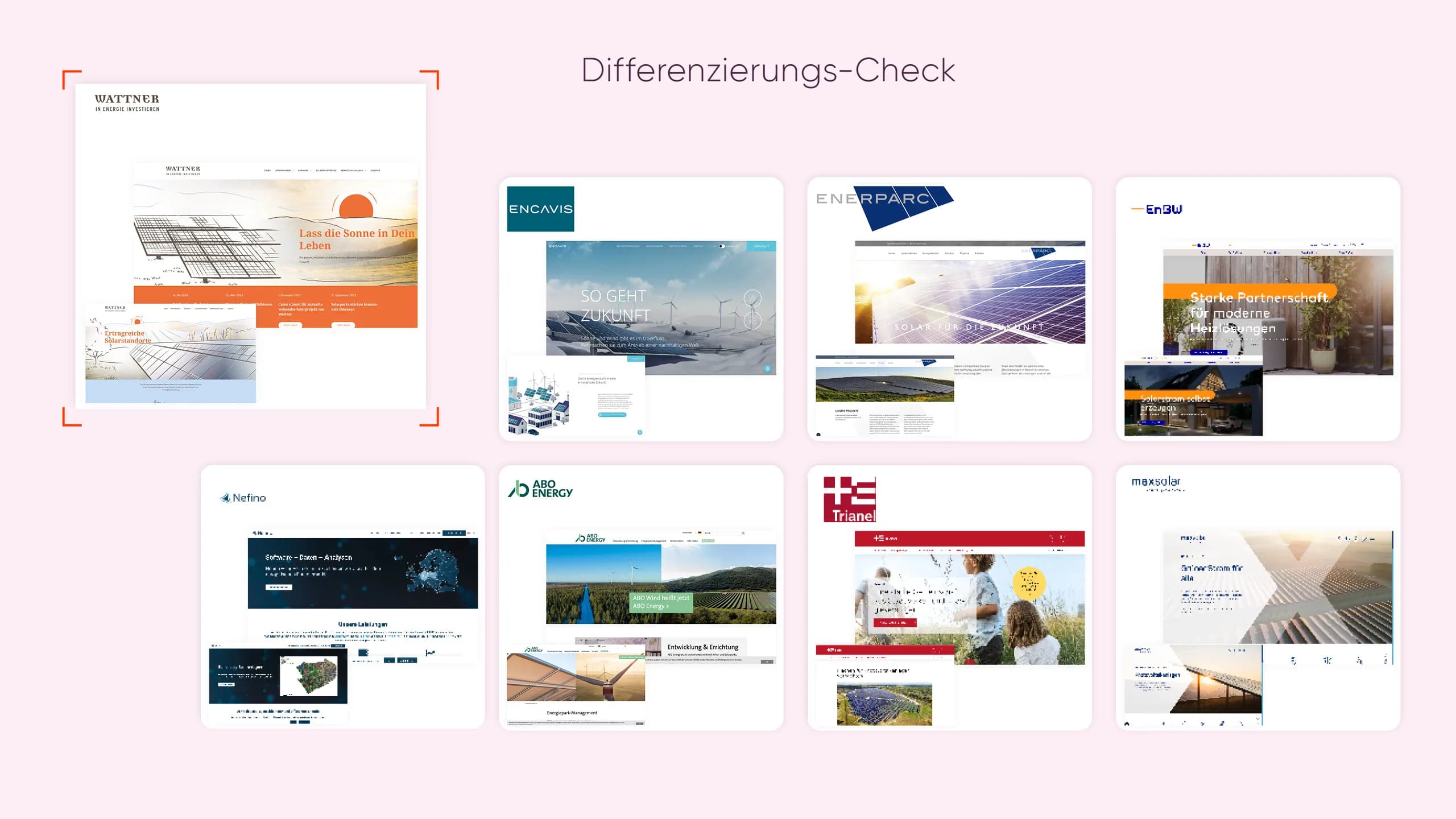
Differentiation check: Wattner’s website compared with the competition

Brand idea

Now there’s movement in the energy game.

The “W” sets the impulse: an animated logo wave carries the energy into all communication. Orange and purple provide the radiance it needs, and organic shapes bring movement into the brand system.

The Wattner logo with the claim “Die Energiedesigner”
Organic waves in purple and orange

Result & impact

Energy that moves.

Website, proposals, business stationery and careers presence follow one system. The brand system translates Wattner’s positioning along the customer journey and gives the brand the trust it needs to succeed.

  • Brand audit
  • Strategy translation
  • Brand style
  • Logo system
  • Logo animation
  • Customer journey
AI-generated
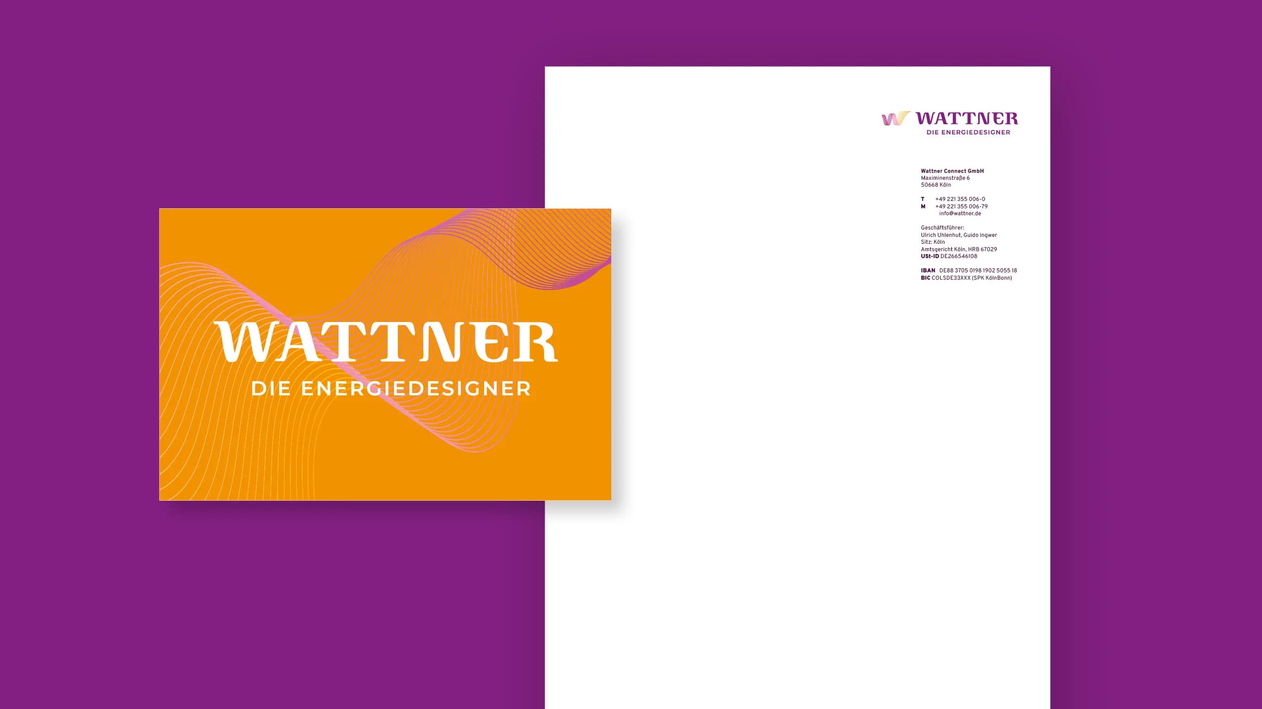
Business card and letterhead in the new Wattner design
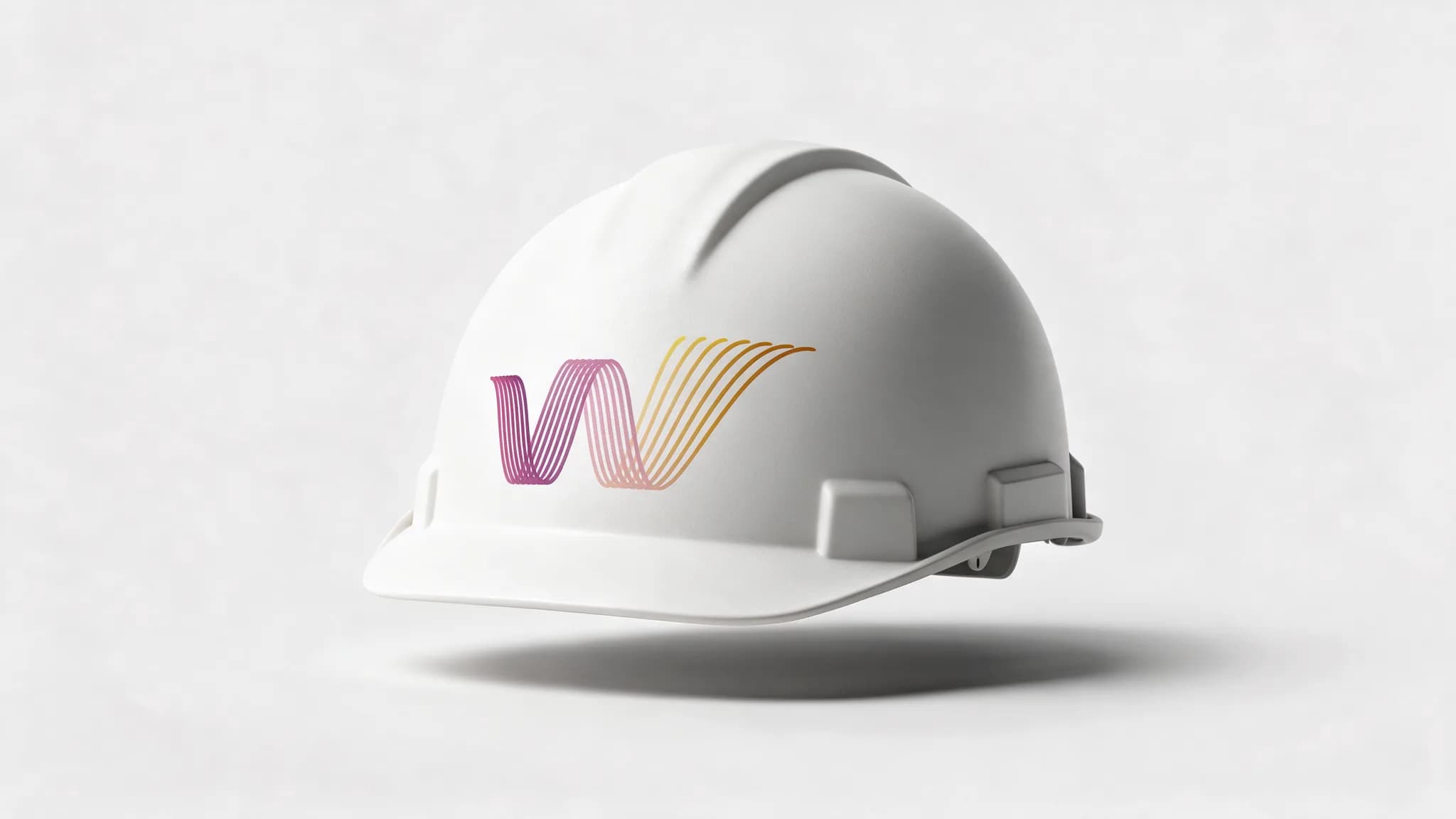
A white hard hat with the Wattner markAI-generated

Key facts

Positioned as an energy designer

5

touchpoints connected

A logo wave in motion

Contact

Your strategy is set, but your brand’s appearance isn’t keeping up?
Let’s talk.

Key takeaways

  • Strategy needs visible proof.

  • Movement strengthens recognition.

  • Every touchpoint carries the brand.

Sabine KropfManaging Director

Sabine Kropf
Maximilian Kratzer

Maximilian KratzerHead of Growth