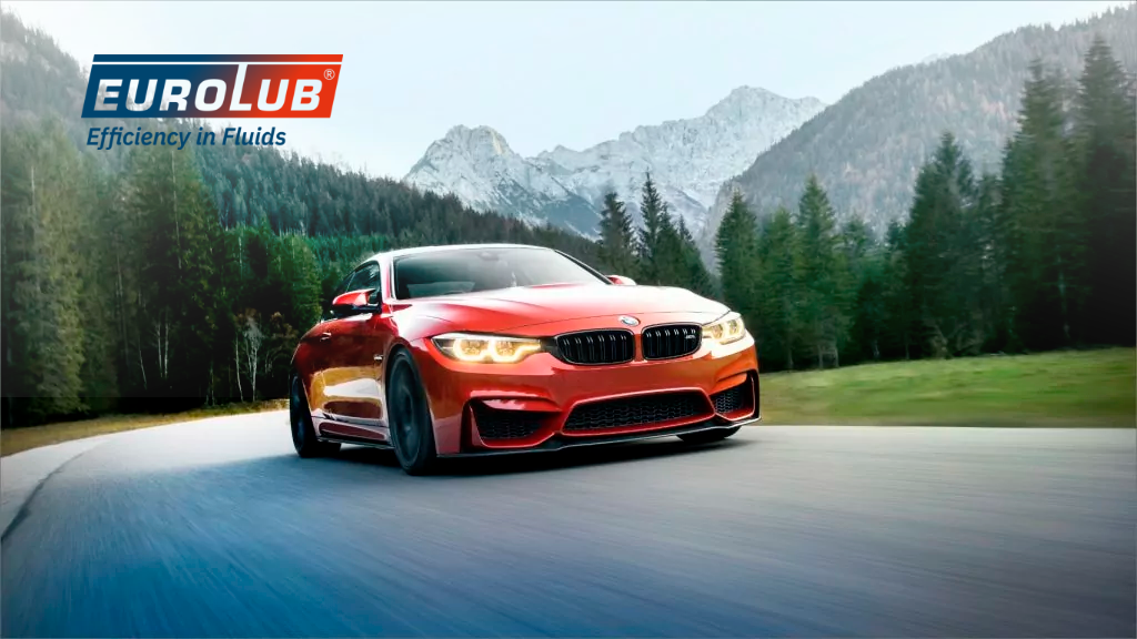
Eurolub: Uniqueness demands a distinctive brand style
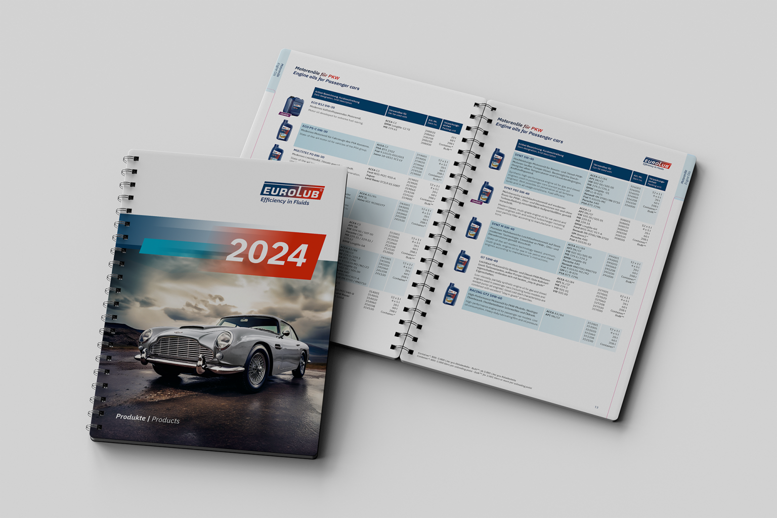
EUROLUB GmbH is one of the few independent brands in its industry. Over 750 products — lubricants, additives, car care, winter chemistry — and a promise: always helpful, flexible and fast. That uniqueness needs a brand style that makes it visible.
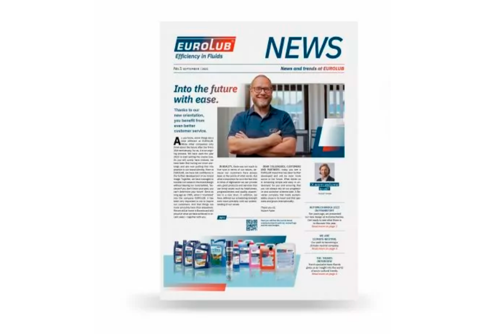
Quality, logistics strength and service are everyday at EUROLUB. The existing brand style had to catch up: translate core values, sharpen recognition, rebuild the appearance across every channel — no corporate look, a handwriting of its own.
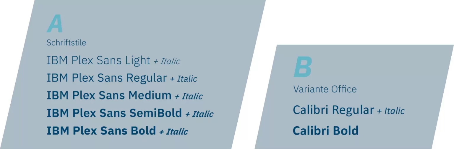
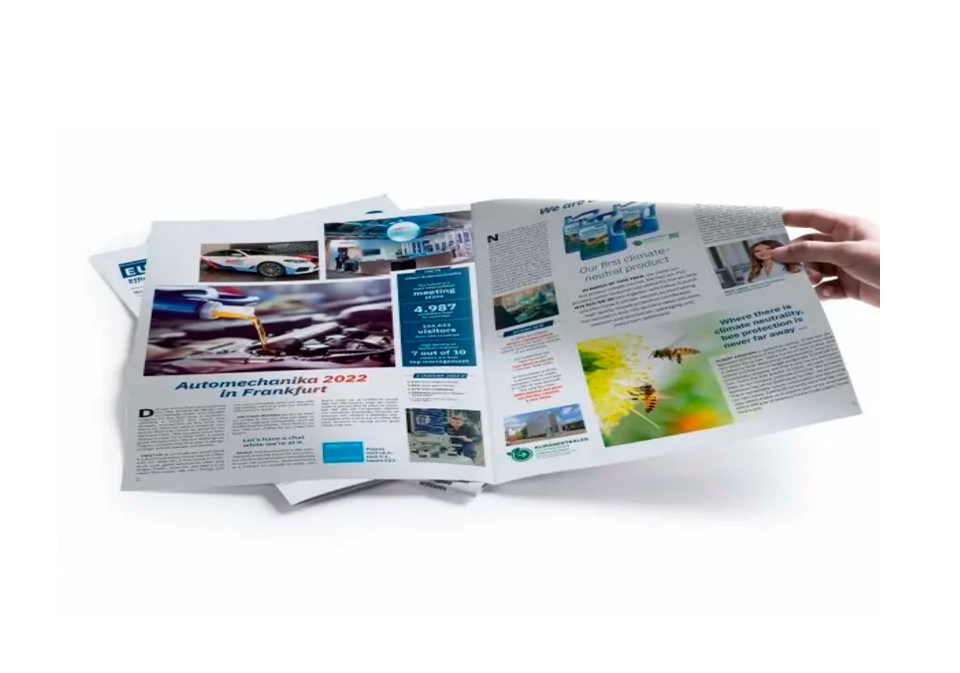
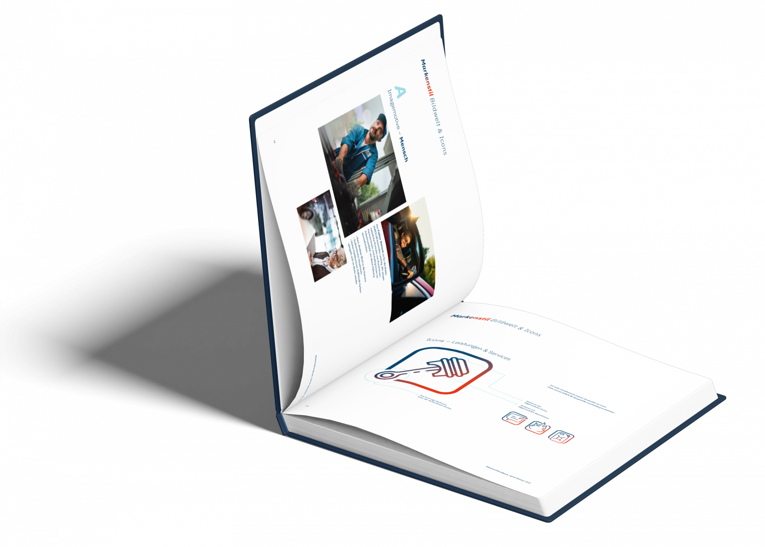
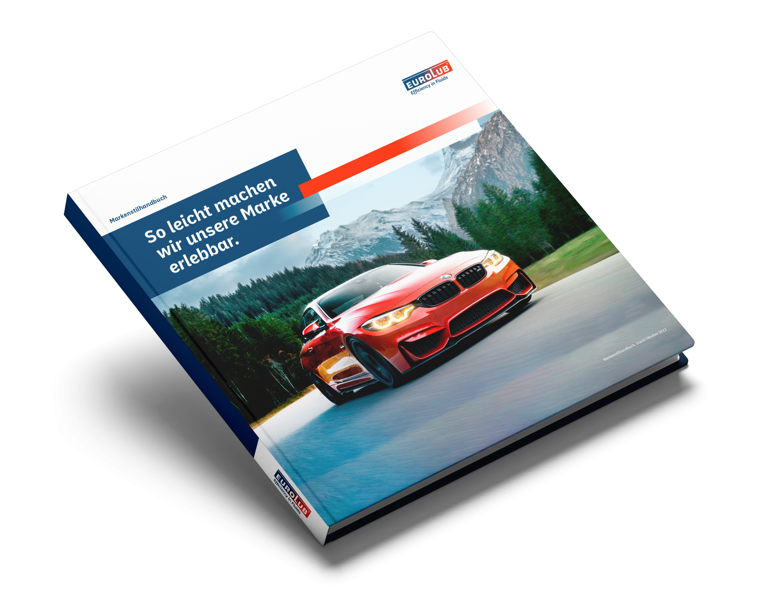
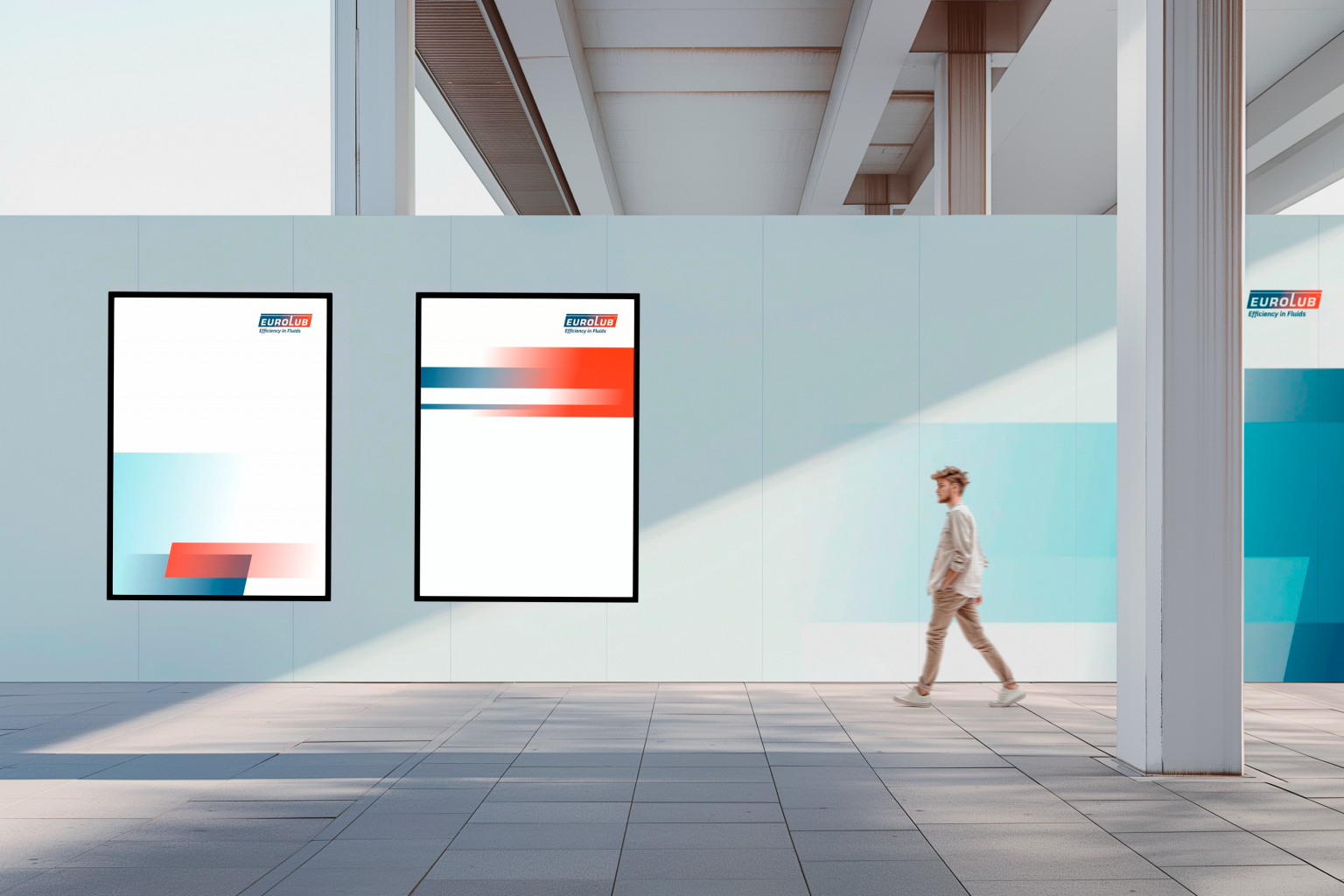
IBM Plex Sans makes the brand readable and fast. The Crossing Area — three overlapping planes in EUROLUB colours, with diagonals for tension — is the stage for every format. Stationery, labels, newsletter and trade fair sit in one system: helpful, progressive, unmistakably EUROLUB.
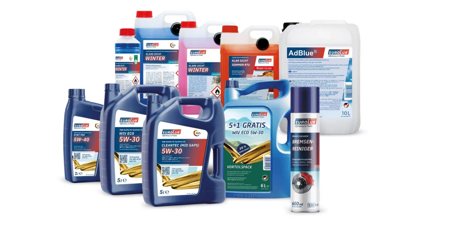
Products in the range
Crossing Area as brand system
New brand typeface


Questions about this project
Who is EUROLUB?
EUROLUB GmbH is one of the few independent brands in its industry, with over 750 products across lubricants, additives, car care and winter chemistry. The brand style had to make that uniqueness visible — without a corporate look.
What did IDEENHAUS do for EUROLUB?
Brand style development, typography, stationery, packaging plus trade-fair and event design.
What defines the new brand style?
IBM Plex Sans makes the brand readable and fast. The Crossing Area — three overlapping planes in EUROLUB colours with diagonals for tension — is the stage for every format, from stationery to the trade fair.
Ready for your brand success?
37+ years of experience + AI power = your advantage. Let's create something great together.